An artist’s work happens in front of a canvas or their preferred medium, but somehow that’s just the starting point: there is a lot of time invested in creating strategies to share that body of work. From applying to grants and residencies, to job opportunities, representation, open calls, and even scholarship and academic-related positions, the time will come to create a strong resume to present yourself to the world.
Summing up all your experience and objectives in a one-pager is a task that can bring up a bit of uneasiness, but it is all a matter of strategy. This is not far from the way artists work with image composition, there are specific rules, important things to highlight, and even standard forms that will help anyone understand what you do with one quick look at the page. If you are facing a deadline and are about to create a new resume or need to give an update to your current one, follow this guide to write your artist’s resume that will make you stand out from the crowd.
Want to access more downloadable assets, plus, hours of recorded webinars, live events, interviews, tutorials, and how-to guides? Visit ArtPlacer Academy. Log in to your ArtPlacer account or start your free trial to visit this learning space for artists, curators, and gallerists.

An artist’s resume is an essential part of your public and professional presentation.
What is an artist’s resume
An artist’s resume is a short-form document that sums up the academic, professional, and personal experiences of a creator in reverse chronological order, this means: it starts with a clear overview of where the artist stands at the moment of presenting their resume. Although they might look similar to other professional resumes, an artist’s resume expands to include career milestones like exhibitions, commissions, and reviews of their work.
A good resume should be precise and concise, highlighting strong and particular skills as well as certifications, awards, and important career achievements. This is of course a general take on a resume: the goal of this document is to present how prepared you are to take a certain position or be selected for a grant. However, not all opportunities are the same nor require the same professional profile, that’s why a resume’s content is not carved in stone.
This is a flexible narration that could be adapted according to the requirements of a job position or an open call, underlining how your training and experience fits the role.

An artist’s resume can go along with a portfolio to make a full presentation of a creator’s body of work.
The difference between an artist’s resume, a cv, and a portfolio
Before jumping into writing your artistic resume, you need to understand the differences between this and other similar documents that are usually requested for specific professional opportunities. Sometimes “CV” and “resume” are used as synonyms to refer to a document that presents an individual career journey, and even though they have many things in common, these are different documents with different goals.
A CV or curriculum vitae (Latin for “course of life”) is a document that paints the full landscape of an artist’s journey: from all formal and informal education to professional experiences, soft skills, and other expertises like languages, developed techniques, explored subjects, exhibitions, awards, etc. Is the “tell-all” document of an artist’s life, it might extend far from two pages. If you need to picture it: take a look at how LinkedIn is structured: a bio or introduction presenting briefly who you are, what’s your expertise and main interests, followed by a full list of professional experiences (in reverse chronological order) with a short list of tasks and achievements, education and certifications. (indicating year and institution, as well of any particular accomplishments), then you can list in detail other qualifications like languages, techniques, and soft skills. A CV can expand to include the full list of exhibitions an artist has been a part of, and their participation in events such as lectures, important commissions, collections, and a bibliography about them and their work,
The big difference between a curriculum vitae and a resume is the extension and the intention. A resume should not extend past one page, including a brief summary or presentation of the artist. Structure-wise, think about a brief artist statement that works as an opening to a recount of your most important qualifications and experiences in reverse chronological order, with bullet points highlighting relevant achievements. A good resume should only include relevant information that showcases why you’re fit for a certain position. The objective is to capture the attention of a selection jury, curators, academic boards, and talent hunters, and get them interested in wanting to know more about you in a follow-up interview or the next step in the application process.
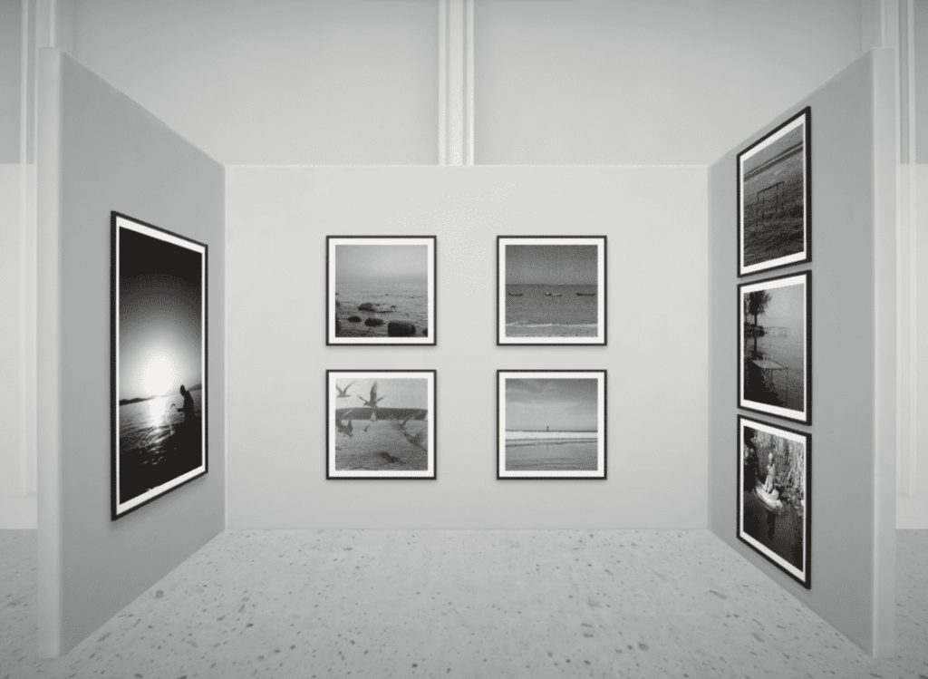
A portfolio is a compilation of an artist’s work, it should tell a story about who you are, what you do, and what are your subjects of interest, mediums, style, and techniques. It should provide a look into your body of work and a walk-through of past and present creations. A good portfolio showcases variety, but more importantly: it reflects uniqueness. Think of it as a small exhibition of your work, and make it so, because living in a hybrid world curating your portfolio as your own 3D Virtual Exhibition is becoming a common practice (and one that makes you stand out).

Your resume should be updated and adapted according to where, when, and to whom are you presenting it.
The art of being ready: when is an artist’s resume required
An artist’s resume should be like an elevator pitch of your artistic persona. With one quick look, anyone should be able to understand who you are, what you do, and what you are bringing to the table. So, it’s an artist’s resume all you need to open doors in your career? Well, it’s a part of your own “kit” of artist tools to present yourself, and it will be required for:
-Applying for grants and residencies
-Submitting your work for awards and contests
-Seeking gallery/gallerist representation
-Calls for exhibitions or presentations in professional venues
Most academic-related submissions, including teaching positions, do request a resume in the first screening rounds, but moving forward a full curriculum vitae might be solicited.
And of course, even though a good resume should stand on its own, an artistic resume will probably be accompanied by a portfolio and, in some cases, a cover letter.
Instead of waiting for the next deadline to arrive, it is a best practice to have a general resume structure ready that you can edit and polish according to the requirements.

Gathering all your personal, academic, and professional information is the first step to achieving a robust artistic resume.
The essentials: how to write an artist’s resume
The first step to writing an artist’s resume is organizing all your information: you’ll later have time to work on the basics of design and polishing your writing. Sit down with a blank sheet and gather all your relevant academic, professional, personal, and technical information.
The second step will define everything that follows: define your goal. Why are you creating an artist’s resume? Are you applying for a job position or an internship? Are you presenting your work to a gallery or museum? With that main objective in mind, plus, the requirement criteria established by the HR professionals or institution, screen through all your personal data to see what fits the role better. Those are the experiences and skills that need to be highlighted in your resume.
With this in mind, you can follow this structure to create your resume:
-Small bio: this short presentation needs to go beyond your artist statement. It should say who you are, what you do, why you are fit for the position, and why you are interested in this particular opportunity.
-Professional experience: beginning from the most recent (and relevant) experience, work your way through jobs, internships, and even any freelance work or commissions if it helps paint you as the ideal candidate. Use bullet points to highlight achievements or tasks you covered.
-Academic experience: mention the institution, the focus of the course or career, and any highlights. Moving forward in your career certain aspects like a final GPA tend to lose relevance: it is all about what you do, not what you DID.
-Hard skills: like techniques and mediums you work with.
-Soft skills: from interpersonal skills to personal interests.
-Personal information: all contact information should be available. This is also a good section to let them know about your work’s reach. Do you have a big online presence as an artist? Have you built a fully rounded professional website? This is the place to make all information available.

And as an artistic resume is as personal as your creative journey, make sure to add certain information that can give a better overview of who you are like:
-Exhibitions: make sure to mention the name of the art show, place, and year, as well as any relevant information like the type of exhibition (group, solo show, etc) and the selection process.
-Residencies, grants, and fellowships: mentioning the institution, year, the timeframe it covered, particular achievements, and affiliations.
-Bibliography: in citation style include relevant media or academic reviews and mentions about you and your body of work.
With this structure in mind make sure to go for a clear, simple redaction style. Use a legible font style and size (a classic Arial, 11 pts, can be wonderful), as well as headings to define blocks of content. Choose single line space and left aligning for all texts. And don’t forget the golden rule: always proofread your resume before submitting it.

A simple addition like adding links that will lead to digital exhibitions of your work can make your profile pop up.
Making your artist’s resume stand out from the pile
A good resume should be simple and easy to read, at first glance. That one-pager doesn’t seem to be the place where your creativity could flow but there are ways to take this simple design and content structure to the next level. If the submission guidelines allow it, you can take advantage of links to paint a fuller picture of your artistic development, and of course: save the file as a PDF just to make sure your document is received in the exact way you intended.
For example, if you are highlighting a particular collection you have worked with, you turn a simple mention into a full experience by creating a 3D Virtual Exhibition with these pieces and linking it to its name. With ArtPlacer’s digital gallery creator you can curate your own art show and share it via a link or host it on your professional website. This tool can be of great help if you want to: recreate a previous physical or in-situ exhibition, do a showcase of the best of your artworks and, even go far and turn your curriculum into a navigable space. Your creativity is the only limit.
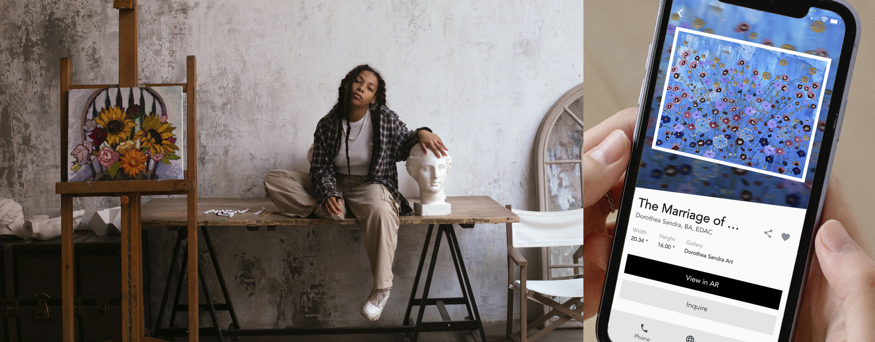
Are you adding your website or social media channels to your contact information? Make sure to have attention-grabbing visuals of your artwork! Use room mockups like ArtPlacer’s Room Mockups to create images of your pieces in realistic (and size-accurate) digital rooms to ensure visitors will get a better understanding of your art and how it interacts with the space.
You know why you are the right choice for that role you have been eyeing, and now you know how to upgrade your artistic resume to get that desired interview or call back!


