People often say: “when there is a will, there is a way”. But for many artists there is a more profound realization: where there is a need, there is a creative solution. When photographer Steven Koppel was curating his own brick-and-mortar gallery he saw the need for an interactive space where the benefits of digital art marketing tools could co-exist with the experience of being present in a gallery.
Koppel sat down with ArtPlacer and shared his insights and how he came up with a creative use for Website Integrations beyond a web page, bringing it into an in situ experience.

Tell us about your background: how photography came into your life and how was this gallery created
For most of my career, I was a business consultant. Photography is fairly new to my life, it started not long ago as a hobby. I live on Cape Cod and I found myself out on the beaches with my camera. It was initially something I just enjoyed, a new activity for myself, but unexpectedly it became very therapeutic when I had some medical challenges in my family.
I realized that my images were allowing me to express feelings, experiences, and emotions that went beyond what is possible to express in words. Then, photography started to become a more important part of my life. I learned more about how to use my camera for creative expression. I was very lucky to have a mentor who helped me develop a perspective and style. Photography is now very spiritual for me, regardless of the weather or the conditions, I find myself on the beaches. I go to the same places all the time, and every time there is something new that catches my eye.
I use my camera in different ways to allow the images that I create to reflect those experiences. Sometimes I move the camera along with the water, other times I use a still camera and a longer shutter speed. I’m always experimenting with new techniques.
I had the honor to be in a gallery in the same town (Cape Cod), they had an appreciation for the ideas and the imagery I could bring. This sparked the idea of me creating my own space where different parts of my life could come together.
What does the Expression Gallery mean to you?
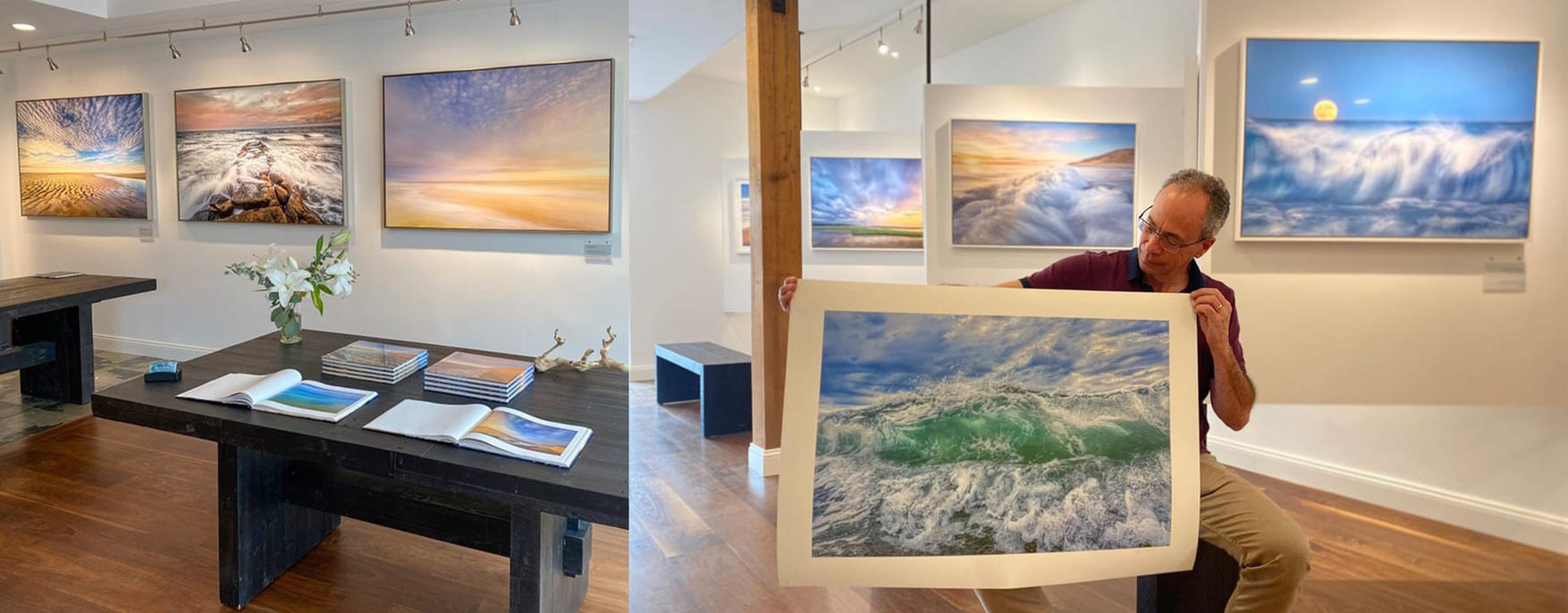
The Expressions Gallery is now in its third season. It’s filled with images of Cape Cod. Various expressions of my experiences. What I love the most is sharing those stories with others.
But the gallery is more than a place to show my images, I do a lot of philanthropy here. I created a non-profit organization called EDI Institute, which has its headquarters in this space. Our mission is to allow people to create images on mobile devices to express feelings and experiences, it allows them to face challenges, from mental illness to addiction, and homelessness.
I also have a strong affinity with a local organization: the Association to Preserve Cape Cod, which focuses on the environment. I’m on the board and I donate 20% of the gallery’s profit to their efforts. To me is a way to raise awareness of the environmental challenges we face down here.
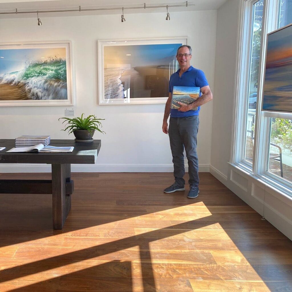
The whole idea of expression calls for “being present”, be it on the beach or in the gallery. How was the curatorial process and how the idea of the gallery itself came to be?
I put a lot of thought into it from the beginning. I’m fortunate because as a business consultant, I worked with retailers all over the US designing experiences for their customers. I already had designed rewarding experiences for customers before, but I don’t think of people that come here as customers, I see them as guests.
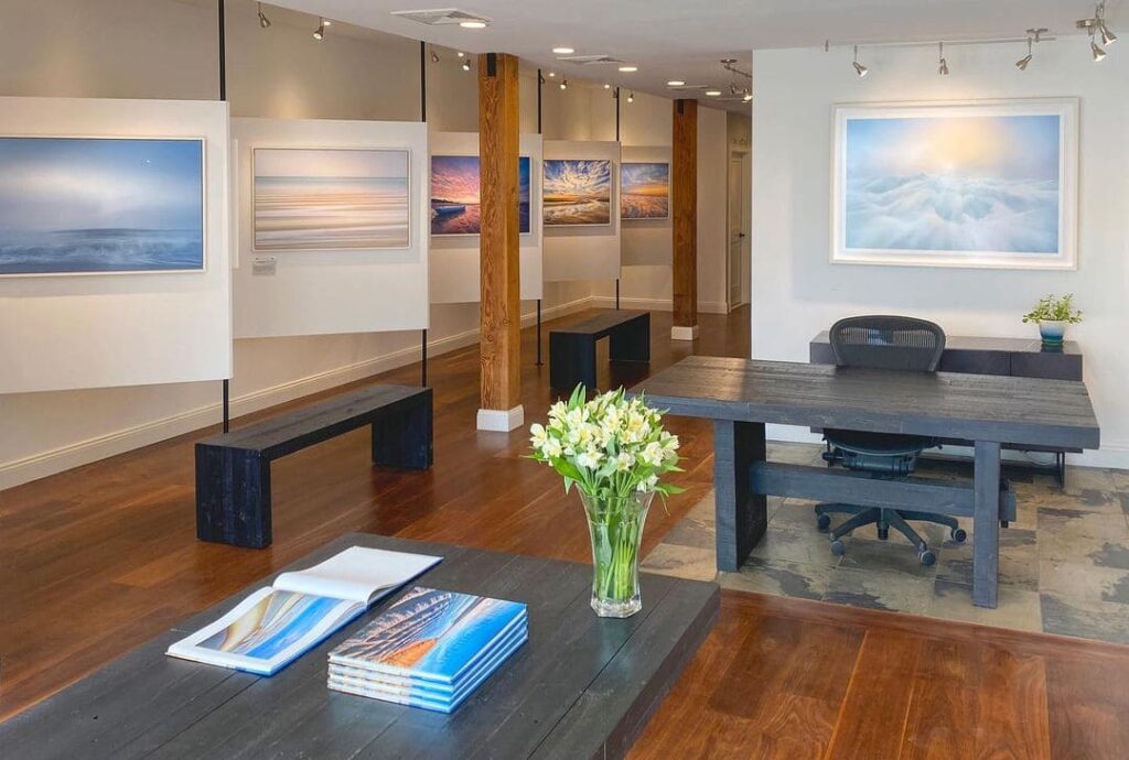
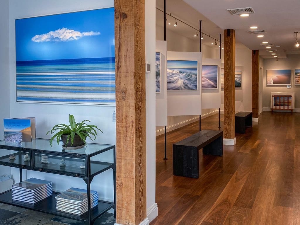
We have different areas in the gallery. The front area is a welcoming space, very wide and open. It has some of the larger images but with a lot of open space, and no printers or retail elements are visible. This is a space to welcome people and to share with them a little of the story and what they are going to experience.
The middle part of the gallery is the exploration area, where people have the opportunity to walk through a long hallway with diagonal images. They are like small viewing booths. Part of the experience is allowing people to take the time to explore. Each image has a little plaque or label that explains its meaning, technique, or something about the place. It tends to have a museum feel. Even if someone is not interested in buying, they learned something and enjoyed the experience of just being here.
The back part of the gallery is where we think of interacting with people. There is a table where visitors can sit and a screen where they can see images. On this screen, we create room mockups while we enjoy snacks and coffee. We invite people to spend time here.
Even if someone is not interested in buying, they learned something and enjoyed the experience of just being here.
Steve Koppel. About the concept behind the Expressions Gallery.
Artists might struggle with creating a brand and a storytelling around it. Do you think your business background influenced how this space was created?
I like to think it is 50 / 50. My business background has formed me and helped me appreciate the whole idea of offering an experience to the customer, thinking about how they will feel when they are here. My artist side thinks about the curation, what images are going to be on the wall, how are they going to be displayed, and how are they described to people. What people experience here is a strong mix of both sides.
What would you advise to artists who are struggling with the art business or art marketing side, or who are just beginning?
I think probably the most important thing is being aware that the business is very important. The decisions that you make in terms of what art goes on the wall, how you price it, and whether you are going in the gallery or online, all those things matter. The best advice I would give is: if you don’t have that experience, get somebody who does to help you. It could be a friend or someone who works part-time.
We made a lot of business decisions. For example, I don’t sell online because it would be against the brand and the impression I want to leave on people. I also decided to make open editions. I want people to want a piece because it brings happiness and joy, not because it is a limited edition. Being thoughtful about all of those details is very important.
Those decisions are also a part of your statement as an artist. You don’t have an e-commerce, but you do use digital tools. What was the need that you saw in your gallery and what solutions did you find?
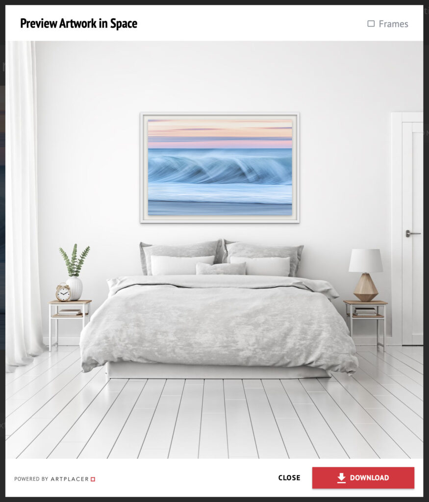
I wanted to be able to provide people with the ability to visualize any of these images in their own homes and that was key. One thing is to see the image on a gallery wall, in the size that it happens to be, with the selected frames and colors, another entirely different experience is to see how it would look in your dining room or bedroom.
That idea was fundamental to the design of the gallery. We wanted to be able to do that interactively while someone is here actively contemplating acquiring a piece of art for their home. With ArtPlacer’s integrations, we can say “Let’s take a look at how this would look in your family room”. Customers tend to have a picture of their homes, even a family picture where you can see the wall where they are considering placing a piece of art. We use the Client Room widget and show them on a big screen on the wall how the piece could look in their home or office.
I’m engaged with them at the moment. We can explore different images, sizes, and frames, put them side by side, and toggle between them. I often sit with people for an hour or more as they are making an important decision. This is a big investment and is not about dollars, it is about what they are going to see on their walls every day.
If the visitor doesn’t have a picture of their home, we use the Sample Room widget with spaces we have previously curated. We put the images in those rooms and we follow up with the customer after their visit. They can send us pictures of the room where they want to place the image and we create a portfolio with different options of sizes and styles, that we send via email.
Do you also use ArtPlacer’s Frame Builder for these mockups?
Yes, we use it. We have recreated the specific frames that we use in the gallery on the web app, so once we are working on a client room we can specifically show them those options and create a mockup for them.
It’s not common to offer this experience to visitors or potential clients. What is their usual answer?
We have many customers telling us they have been looking for a long time, they see things in galleries but they are not sure. When we show it to them in their own room they become sure because they can see it, visualize it, and feel it.
Integrating the ArtPlacer tools into our business has generated a large number of sales that we wouldn’t have otherwise. This is what I had in mind from the beginning, I didn’t know ArtPlacer at the moment but we did some research looking for a tool that could help us create this experience and now the widgets are an integral part of everything that we do.
Being able to create mockups for the customer is a very important part of what we do. I’m convinced we wouldn’t have these positive results if we didn’t integrate it into the physical space and were willing to create mockups of the photos on their walls for the visitor and share the finished product with them either here in the gallery or afterward.
We have been very successful in our first three years and we are positioned to do even better, and a lot of that is because of what we do by creating room mockups for our visitors.
There is an interesting insight there: this is not only about having the tool available. As an artist you have an understanding of composition and lighting, you know what makes a good image and the user trusts your vision and aesthetic.
Absolutely. Customers are really appreciative of being able to visualize this. Once they see it they are more likely to buy, and more importantly, I don’t think we have had a single case where somebody is disappointed with their choice.
With ArtPlacer I can show them how the picture will look in a room in its real proportions. We can show them different sizes of the same image, so they can pick the one they think is best for their space.
I’m always in touch with people afterward. They share pictures of the real thing, and how the actual installation of the image looks in their home. To me, the most important thing is to help them make the right decision for themselves by having the best comprehension possible of what they are acquiring.
Editor’s note: This interview has been edited for length and clarity.
Thank you for sharing this experience. Very helpful.