Your artist, gallery or art business website is your window to the world. It’s a space where you can showcase who you are, and what you do, and open opportunities for new connections like art purchases, collaborations, and even press publications and reviews. But for a website to be readable, attractive, and findable, in a sea of other art-related pages, it has to have certain characteristics.
What makes a good art website? Keep reading to find our guide of do’s and don’ts for webpages.
Download for free “The ultimate artist’s website checklist” to review your own site and update it.

What structure should an artist or art business website have?
Whether you are updating or starting from scratch a professional artist website, an art business page, or art print e-commerce, your starting point is defining the main structure for the site. But don’t worry, when it comes to creating an attractive and readable website, simplicity equals success.
You can start listing on the drawing board what are the main things your website should communicate, for example: essential information about you, your background and art experience, a showcase of your artworks, a way to contact you, and even options to buy one of your pieces. Each one of these main communication goals will later translate into a main page that will be featured both on your main menu and your homepage.
Knowing your main page from the start will help you design a website with a clear navigation. What are the pages every artist website should have? Check this list:
–Home page: it’s the first page the visitor to the website sees and it should introduce them to the website itself.
–About page: in the case of artists, this is where they should present themselves and what they do. For galleries and art print businesses, this is also a presentation page where they can talk about their work and present their brand.
–Contact page: this is a simple page with general contact information for potential clients, fans, subscribers, etc. Make sure to add your email and a link to your social media profiles.
–Blog: articles and different types of short and long reads are essential for SEO (Search engine optimization) and to help you develop the storytelling around you, your brand, and your art business.
–Art shop or e-commerce section: a space dedicated to the commercial part of your art business where visitors can easily visualize your pieces, inquire about them or go through a seamless art purchasing process.
Art website design dos and don’ts
You now have reached the point where you are going to pick an original design, work with a designer on the perfect look, or pick a theme or template that really resonates with your style. But before you make any decisions, take these general design rules into account to ensure your website will be readable and attractive to visitors:
-Don’t use more than two typographies, one for the titles and one for the general texts.
-For general text go with a font size between 12 and 16.
-In order to highlight links, keep all descriptive or complementary texts in the same style, color, and font.
-Come up with a color palette that represents your body of work, and stick with it.
-Avoid high-contrast color schemes, for example: bright typography over a black background.
-Make sure the theme or design you picked is mobile-friendly, most users will visit from their mobile devices.
-Yes! We want to see pictures of your art but avoid clutter of images.
-To avoid long loading times image sizes shouldn’t be larger than 100Kb -250Kb. Compress or resize your images.
-Make sure your branding comes across the whole website.
Your art website homepage: a window into your world
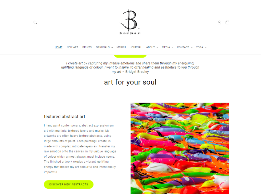
It’s time to get into creative mode and start making your homepage a reality. Think about it: this is the first impression any visitor will have of you when they enter your URL on their browser, it should be easy to figure out, it should represent who you are and the type of art that you do, and also communicate any big events or important information you want to put out there.
How can you achieve this? Follow this structure to build your homepage:
–Top menu: your design should have a top navigation bar where the user can easily find all sections of the website with direct links to them.
–Search bar: make it easy for visitors to find the precise content they want to see.
–Main banner: are you promoting a new virtual exhibition? the release of your next collection? an upcoming show? Use this space to highlight the most important content you want visitors to catch at first sight.
–Sections or highlighted content: each one of the main pages of your website should have a highlighted section on the home page with a call to action linking back to the page, providing the visitor with a seamless experience.
–Call to action (CTA): each section, block of content, or banner should have a clear call to action or a self-explanatory text encouraging the visitor to take a specific action like: “Visit the online show”, or “Join the newsletter”.
–Newsletter opt-in: building a mailing list is a great asset for any artist or art business. If you want to grow your audience, add a banner, pop-up, or section with an opt-in form to join your newsletter. You can use the “Subscriber form” from ArtPlacer for this purpose.
Another good idea is turning a Virtual Exhibition into a lead magnet and hosting it on your main page. With this new lead-generating feature, visitors will be asked to provide their name and email to access your online art show. This is an easy way to grow your contact list. You can manage all new leads from the “Contact” tab on your profile.
Begin generating leads and connecting with potential collectors: start your ArtPlacer free trial today.
–Footer: and finally your homepage closes with a section with clear text links to the main pages, links to your copyright information. On your Footer, you should also add terms and conditions for shipping and other services you might have available on your website.
–Social media links: make sure to add a full list of all of your social media profiles on your footer. A good practice is to use a version of the logo of the social media that people can easily identify if they want to stay in touch with you through that channel. Make sure to also add a link back to your email info.
What an artist “About me” page should say
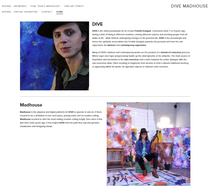
Let’s talk about you. The “About me” or “About us” page of any art or art business website is the space where you get to tell your story: where you come from, what you expect to achieve, what inspires you. Remember that people develop empathy with your work and with you, this is the place where you let them know who you are and let that relationship flourish.
So, what should an “About me” page say?
-It should have a short bio of the artist, art collective, gallery, or art print business, depending on the case.
-Include a picture of the artists or team. Go the extra mile and share a picture in your studio.
-Give the reader a rest and intertwine some of your most important artworks in the design of the page along the text. This is a great space where you can use Room Mockups of your art.
-If it’s an artist “About me” page there should be a section dedicated to your resume highlighting prices, residencies, and other important milestones in your career. Preferably, summarize everything in a downloadable PDF file.
-You can also add your artist statement to give the reader a better understanding of your views as a creator.
-Make sure to also add a “Press” section with all mentions of your work on digital media or traditional press like reviews of art shows, interviews, etc
-Have a clear CTA of where people should go to contact you for further interactions.
How to improve the e-commerce section of an art website
“How to sell art online?” This is a question on the minds of most creators. One of the best resources you have is to take charge and do it on your own. All you need is to build a strong website that supports an e-commerce section where potential collectors can browse through your pieces and acquire them.
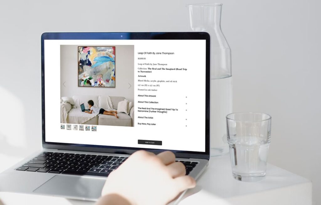
How should a good e-commerce section look on an art website?
-Each artwork should have its own page with a proper description of the piece including themes, subjects, and medium. AI Technology can be a great ally in creating SEO-enhanced texts.
-There should be a clear display of the size and weight of the piece, as well as framing and matting options if this service is being offered.
-Highlight shipping options if these are available.
-Have a clear and visible “Buy” button for a seamless purchase.
-Offer a “try-before-you-buy” experience with ArtPlacer’s website integrations. Add a “See it on your wall” button and allow the potential collector to see how the piece would look in their space with the help of AR technology.
-Make sure to have professional-quality photos of each artwork. Give users the chance to have a better sense of how the piece will look in a space like a living room or office with Room Mockups.
-If you are offering art prints, make sure to make mockups of your artwork in each available size. A good practice is to offer at least 3 sizes: small, medium, and large. Check this exclusive ArtPlacer Academy lesson where photographer Chase Teron shares how to create Room Mockups of art prints in bulk.
-Add social sharing buttons. Help visitors who are interested in your art make an echo of their art findings on their profiles, this helps you build social proof of the impact of your work.
Pro-tip: a good way to drive direct traffic to your website and engage visitors on a journey that leads to art purchases is doing an online art show. With ArtPlacer’s Virtual Exhibition, you can host your own showcase with all the options for a seamless purchase experience. With a killer art marketing promotion strategy, this is a good way to capture potential collector’s attention.
Now that you know all the basics that make a good art website, it’s time to take your checklist, review your own website, and make the necessary upgrades and updates to drive it to success.
Get the Art Marketing tools you need today. Log in to your ArtPlacer account or start your free trial today.


Hi Laurie,
We tested it and seems to be working correctly. Check your spam folder for an email with the subject “Get the Free Art Business Website Checklist”.
Hope this is of help.
The ArtPlacer Team
Fantastic article. I’d love to download the checklist, but it gives me an error message.