Online art galleries came as an innovative solution to shorten physical distances in a globalized world, and expand artists’ audiences. Who would have imagined you could preserve your perfectly untouched curated exhibition, while breaking the barriers of physical distances and limitations of physical space, and have multiple online exhibitions to be shared simultaneously with the world?
The art world has been impacted by the pandemic, undoubtedly. With restrictions, safe distances, and travel bans in place, making a successful exhibition became really challenging and for many upcoming artists, a wall was raised upon them on their path. The ordeal was how to create an impactful and meaningful experience with art, through the means of technology. And online art shows became the perfect solution. A solution that has come to stay, as it has brought a window into the future.
Translating an organic and analogue experience into something digital that creates a feeling of connection with the art pieces, has been the issue for many in the art community these past years.
In this article, I will be sharing with you tips on how to curate an online art gallery, to create that feeling of closeness and a connection with art, at a click’s distance from your audience.
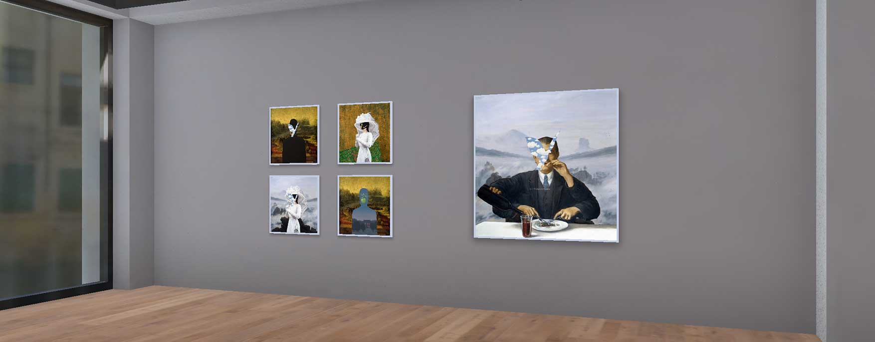
Salvador Demo Exhibition.
Contents
Getting started with your first online show
Those with an avant-garde approach started innovating and exploring the digital world and found the many advantages that virtual exhibition platforms have to offer. For many galleries that had to close, or whose venue is too small, the virtual space has provided them with an unlimited and ready-to-use space that they can customize and share at a global scale. Bringing audiences closer and generating the experience of being at a gallery but from the comfort of their home.
You may be curating an exhibit to showcase a new collection, to expand the horizons of your art gallery, to mark a specific event, or to achieve an idea you had had previously in mind.
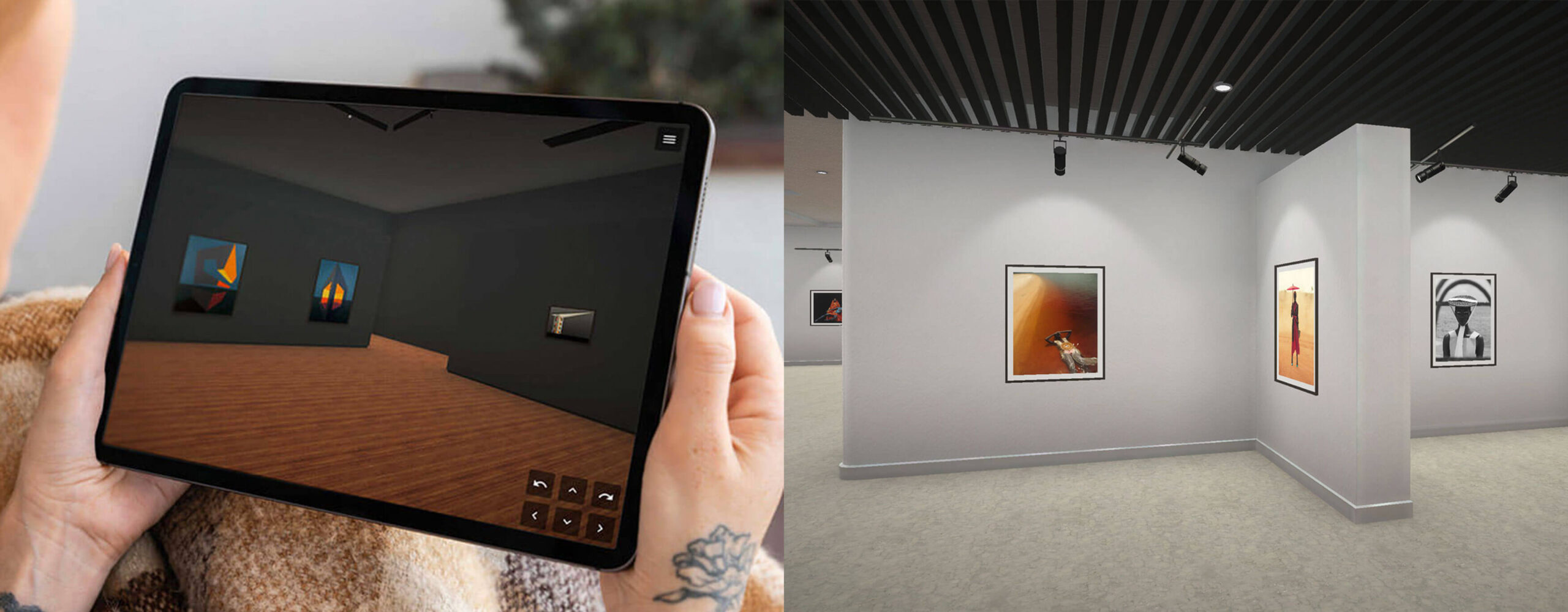
The curation will start once the artworks enter into a dialogue with the space. Different from when curating in a physically bounded space, virtuality allows the curator to expand the elements they count with, and this should be taken into account when curating and creating an exhibit. ArtPlacer offers the possibility to curate your exhibition by adding 2D art pieces, videos and sculptures in many formats, such as JPGs, PNGs, NFTs, Videos, and GIFs. Options that coexist comfortably in a virtual gallery, presenting no installation hustles, and showcasing a variety that enriches that dialogue between the selected art pieces and the venue.
While in the physical world you may be limited to the space you have or the venue you can afford with the project’s budget, virtuality allows you to choose from a wide variety of different spaces and customize it according to your intention. The sky may not be the limit, but it gets pretty close.
How to create an atmosphere on a virtual gallery space
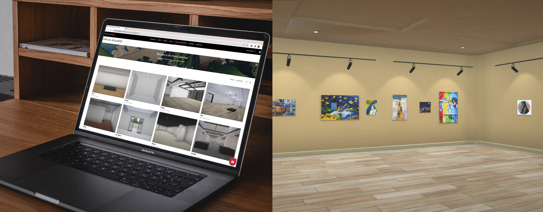
Take advantage of the possibility of customizing the venue exactly as you want it. While in the real world you may not be able to change the ceiling or floor design, in virtual exhibitions you can. Think big! Why stay with a regular default space if you can curate the whole experience? You can select the colors of the walls, and play with the textures of the floors to create the space you desire.
When choosing the venue, you are deciding where the artworks are going to be seen, creating the context for the experience you are curating. Consider if you prefer a space for a small artwork selection, like a small and intimate gallery feel. Or if you need a bigger space for several artworks, like a museum or art fair. This will help start setting the atmosphere of your exhibition.
Ask yourself if you prefer a more intimate, elegant, exotic, or futuristic feel, and play around with the colors and textures that will result in what you are looking for. Think of what your exhibition will be about, and how the context in which your art will be shown can enhance the message of your collection.
You are building a space, creating an experience, and you can make use of the advantages of virtuality where there are no problems with the lighting, there is no cost in changing and trying as many colors as you want on the walls, and there is definitely no problem with the capacity of people that the space can host or if the wine table will be placed near or far from the entrance.
So, explore, play around, try out new things and see what will create and set the perfect place for the artworks.
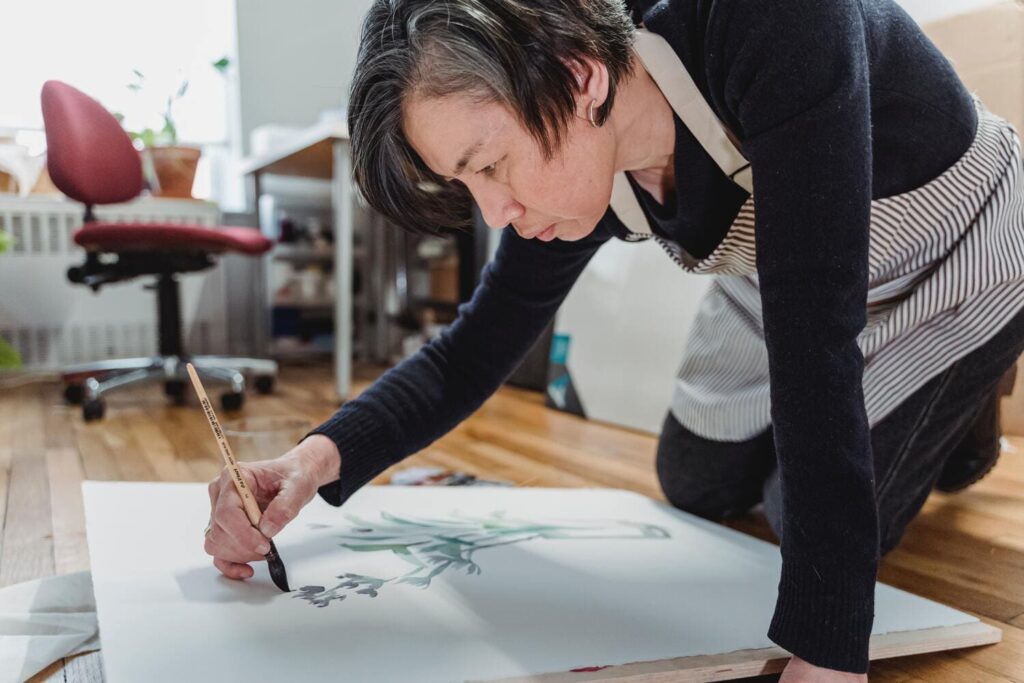
What is your exhibition about?
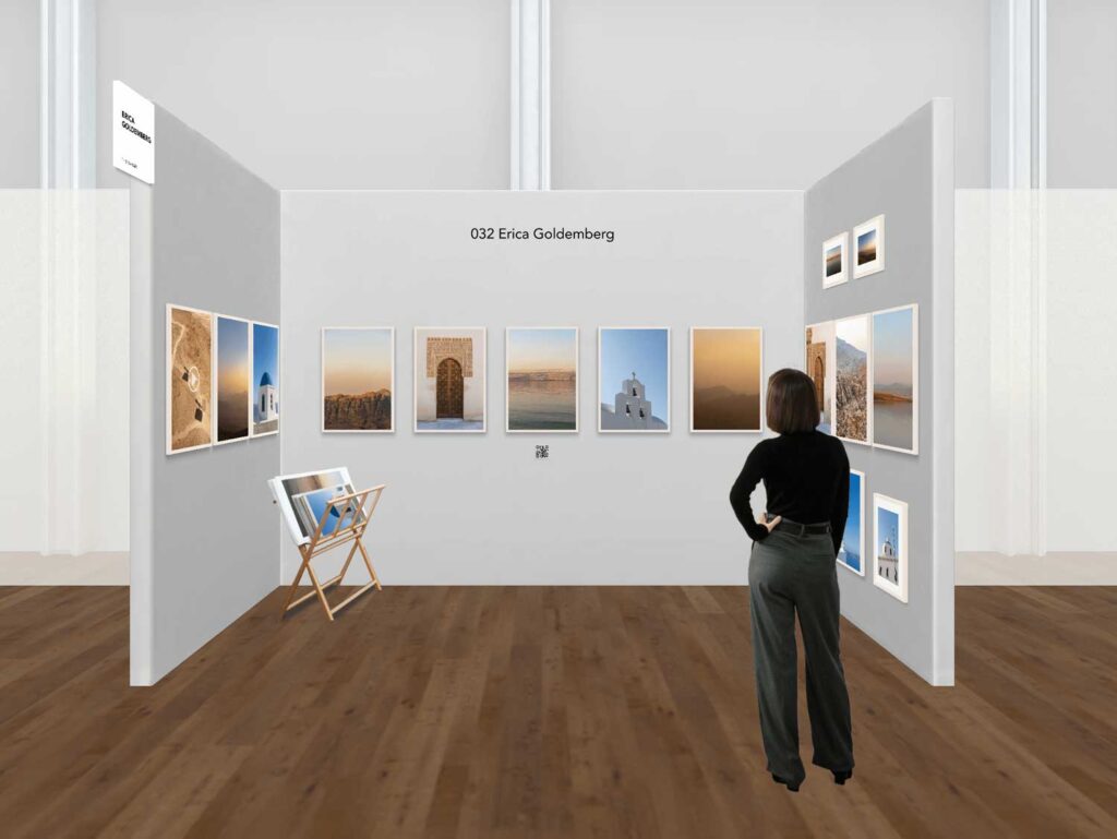
Don’t just drop artworks and place them on the walls. Just because virtual curation is easier, just a couple of clicks and you have a set of artworks installed, it does not mean that the curation is less relevant. Constructing harmony amongst the artworks as well as spacing and position should be treated with the same relevance as in a brick-and-mortar exhibition.
The artworks you select will not only be appreciated individually but also as a whole. When a collector or your art community navigates the space, you want them to explore it and enjoy not only each painting, but the story of the order of the disposition of the artworks. Have this in mind as you pick the placement. You can also decide to add a frame to enhance the presentation of the selected pieces, and even to create a visual reference between collections.
If there is an interaction between artworks or a relationship uniting them, emphasize it through the placement in the space. Whether it is by medium, year of creation, color, or the story they contain, there should be intentionality in the placement of the artworks that will develop and result in the Why of the selection.
Either if you are exhibiting video, photograph, or artwork, think of the cohesion of what the audience will be looking at. The audience will see a painting and have an impression of it, and after that experience, they will look at the next piece. Think about what you want to evoke. Sadness? Tenderness? Horror? Stillness?
The result will be of the one you decide to include in your exhibition, in the tone of the gallery and the feelings that are being evoked by those artworks in that space.
This brings me to the next point… the importance of a curatorial statement.

Creating a Curatorial Statement: the heart of your exhibition
Ideally, you have started curating an exhibition knowing what the exhibition will be about and what your intention is. As you start curating the space, and placing the artworks, the idea starts to become a reality that can be seen and explored.
Although visitors will be surrounded by the exhibition you’ve created and some will not require reading to understand your vision, it is a good practice to have a curatorial statement in place, in order to introduce the viewer to the experience of the exhibit.
You may share a bit about what the show is about, some more about the artist, the concept or the process of curation. “What is the exhibition about?” is the question that inspires the curatorial statement. These are some topics you may touch upon:
– Expand on the concept of your exhibition
– The context that helps understand the lens with which to look at the exhibit
– The research process
– About the artist’s inspiration or biography
– The artist’s technique
These are suggestions of topics you may include, but make sure to use them only if they are relevant to your exhibit. Curatorial Statements are better, nice, short, and clear than extense and with no substance. So take it as an opportunity to add something that will enlighten your process or concept for the display.
This will also result in the title of your exhibition. A title should involve the general sense of it. The title of the exhibit does not necessarily need to explain anything, but it plays an important role, almost like a clue that is understood after the experience, rather than before.
A title will draw the attention of the audience and should remain as an encrypted reminder of what they have just experienced. A keyword or sentence that will first invite curiosity and later evoke a memory of what the exhibit was.
Why should you add a brochure to your exhibit?
Brochures are essential to the exhibition since they will remain with the viewer even once the exhibit is over. This should be a sort of catalog, where viewers can read about the show, the artworks, the artist, the curatorial statement, and the prices (if you decide to include them).
A digital brochure is useful since you can have people download it easily. You can even add it to your exhibition, so every viewer can access it as they look around. This is a fantastic way of concentrating all of what you think enhances the experience as additional information, without disrupting the moment when the viewer experiences the artwork.
Include a bit of info about the artist, maybe if the curation required research, and anything that you find to be relevant. By doing this, you can share the information without the need of having to place long paragraphs across the walls, which can be overwhelming for the viewer. You can dose the info by sharing a curatorial statement on the first wall near to the title, and then have the brochure for visitors to freely read and explore at their pace.
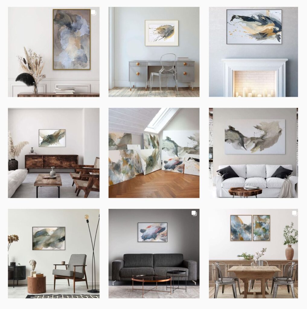
Build momentum
Nowadays, we are filled with news, images, and things going on in social media. Too much news and too many things happening. The chances of someone remembering the only post you did announcing your virtual exhibition are very low. Instead, build momentum by setting a date for the official opening and sharing teasers to start preparing people for the inauguration. I would suggest that you take a look and take notes on this excellent article: How to create a killer strategy to make your Virtual Exhibition sell.
Think big, make your content relevant and full of life. You can go with the typical still poster, but if you can try and make it stand out. You can interview your artists, or the curator, and share parts of your research or create moments of your team and artists. You could also keep it classical, and start inviting through personalized digital invites, but this is one of the many options of the digital world. The article above goes into full detail and I think anyone starting out or wanting to improve their marketing strategy for the exhibition, should take a look at this great resource.
The world is your stage. You don’t have to limit yourself to those in your community. You could share it at a global scale: on social media, email marketing campaigns, your site, and have your friends share it too! Have collectors experience the show from the comfort of their homes. Make sure you document the final result and treat it as you would do with a physical exhibition.
Now get creative!
You are all set and ready to create your own virtual exhibition.
If you made it this far, you are now aware of how to create a coherent atmosphere that enhances your pieces and relates with your curatorial statement. You’ve also learned how to create a clear brochure to provide extra information for your intrigued collectors. Don’t forget to make the most out of social media and online marketing tools to build momentum around your exhibit and get as much exposure as possible. After all, having made such an amazing job curating your exhibition, you might as well show it off.
Sign up and start ArtPlacer’s 7-day free trial to start curating your firsts virtual exhibition!
